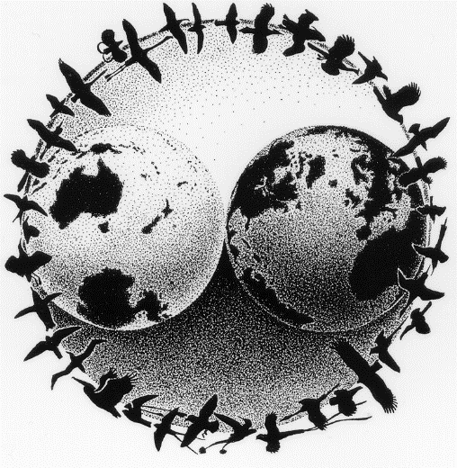
ABOUT IBP’S LOGO AND SEAL
IBP’s original logo was designed by our founder, Dave DeSante, in 1988, and drawn by the acclaimed wildlife illustrator Keith Hanson. It is a beautiful piece of art, particularly when viewed at full size, so that each of the 36 accurately rendered birds can be identified to species.

Dave described the symbolism in the logo:
The intent was to envision the Earth held in balance within a yin-yang symbolism by a wreath of flying birds. My intent for IBP was that the symbolism of balance would underlie IBP’s work and the manner in which that work would be accomplished; this included not only a balance between the feminine and masculine, but also between the left brain and right brain, the scientific and artistic, the research emphasis and the conservation emphasis. The logo also implied that IBP’s focus would include a global, as well as local, emphasis. To this end, the focal points of the two views of the earth (which for balance needed to be 180 degrees removed from each other) were selected so that at least a portion of every continent and every ocean was included.
The original logo remains a beloved part of IBP’s history and legacy, but in recent years we have found that it does not always translate well to digital media and other contexts that were not relevant when the image was designed. The painstaking detail in the image is difficult to appreciate when shrunk down to the size of an icon or viewed on a cell phone, and the delicate features of the birds and the complex shading of the Earth cannot always be faithfully reproduced on apparel or non-paper surfaces.
In 2018, we decided to adopt a new logo to convey IBP’s identity and communicate our mission effectively when rendered at any size and in diverse media. However, we did not want to discard our original logo and the legacy it represents. To preserve this cherished part of IBP’s tradition, we have designated our original logo as IBP’s official seal. Just as many universities and other institutions retain both a seal - an image with traditional and historical value that never changes - and a logo that is allowed to evolve and change over time, we will continue to utilize the original image as our permanent seal, even while adopting a new logo to carry us into the future.
For our new logo we wanted a simple, memorable image that would a) feature one or more birds, as studying and conserving birds remains the core of our mission; b) ensure that those birds are easily identifiable, reflecting our emphasis on scientific accuracy; c) render well at multiple sizes and in diverse media; and d) pay homage and respect to the original logo by incorporating the Earth. This is the design we have chosen:

The globe in the image is meant to evoke the idea of the Earth and to represent IBP’s continuing commitment to conserving bird populations around the world, irrespective of political boundaries. The bird inside the globe is a Wilson's Warbler (Cardellina pusilla), a particularly charismatic and delightful Neotropical migratory songbird familiar to many bird lovers. IBP works with Wilson's Warblers frequently within three of our major programs: MAPS (Monitoring Avian Productivity and Survivorship), MoSI (Monitoreo de Sobrevivencia Invernal), and the Sierra Nevada Bird Observatory, and the species therefore holds special significance for many staff members.
The globe is oriented to direct the eye forward and upward, to provide a sense of positivity. The dominant color of the image is yellow, the color of hope in many traditions, and is intended to help convey our belief that our efforts to conserve birds and other wildlife will make a difference, and our hope for a future with diverse and abundant birdlife.


